Online presentation programs have attempted to supplant the presentation staple PowerPoint for nearly a decade. The market is flooded with online slides, posters, and interactive posters. Not until Adobe unveiled Spark did any program provide the opportunity to present a scrolling webpage without knowing code. Spark is a FREE three-part tool: Post allows users to create social media graphics (i.e. memes, inspirational quotes); Video allows users to create animated videos (complete with options for music and/or narration with images in motion); and Page allows users to create single-page “websites” that function as a presentation tool. Here are the things you need to know about using Adobe Spark Page in your classroom.
It’s a FREE web-based tool, but users must create an account.
Creating an account for Adobe just requires an email address and password. An .edu address is not necessary, so teachers can keep their accounts if they happen to change schools. Students can use the program for multiple classes without having to join any teacher’s class. Each web page a teacher or student creates generates a link that can be shared in a multitude of ways. The account stores all of the pages a user creates so that projects may be edited at any time.
The hyperlinks to the Web Stories maintain the Spark brand—unless the user is an Adobe Creative Cloud subscriber.
In other words, the hyperlinks will begin www.spark.adobe.com/ followed by some random alphanumeric unless one pays a monthly fee. My feeling is that the Spark branded link is not a problem. In fact, it helps students maintain anonymity because Web Stories are public when published.
It is fabulously simple!
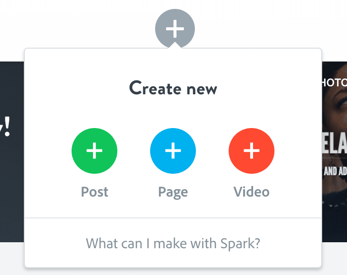
Each Spark project starts with a plus at the top of the page where you select Page to create a Web Story.

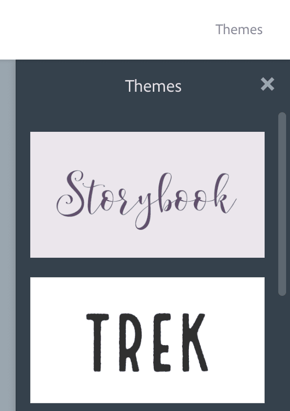
At that point, the page prompts you to add a title and subtitle. No more picking the “best” layout and running out of room because the text and the picture just won’t fit together. If you doesn’t like the color, the change is as simple as clicking themes in the upper left-hand corner and picking the preferred text and color combination.

Scrolling down you will encounter a plus that prompts a choice: photo, text, button, video, photo grid, or glide show. Notice that three of the six choices include photographs.

Here’s my favorite feature: no more searching the web for the perfect image.
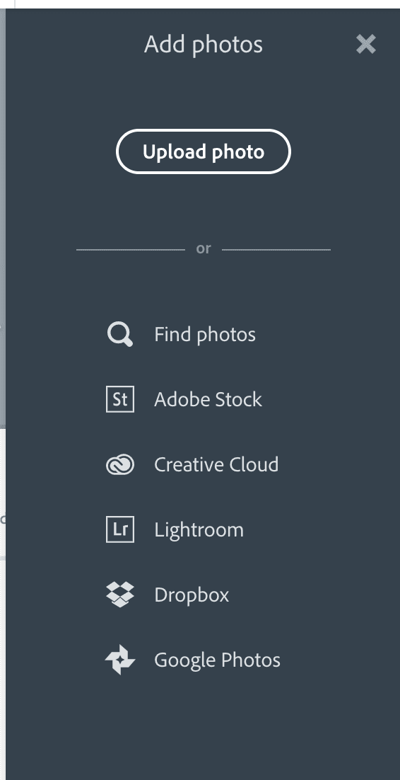
Spark gives users access to thousands of license-free images to display in a number of formats and sizes—from background to collage to individual illustration. Just search for something you like by typing in a descriptor in the search bar that appears when you choose one of the photograph options. Personal images can also be uploaded and used in the same way. And, if you forget something, just scroll up to the plus where you want to insert it and choose whatever it is you want to add.

Finally, no more difficulty with embedding videos that take you out of your presentation that then require you to reenter the slideshow. Spark Page supports videos from YouTube, Vimeo, or its own Spark Video (which I’ll discuss in another article). Just choose video and insert the hyperlink and it will appear. It’s beautiful technology for even the least technologically savvy individuals.
Here’s a sample presentation created by one of my students on “Advice for Freshmen.”
Why use Spark Page instead of a more education-focused product?
The simple answer: it’s Adobe. The free tool Adobe provides that most people are familiar with is the PDF viewer. Other software Adobe governs include PhotoShop, Illustrator, InDesign and many, many more. Their full suite of programs can be accessed through one-time purchases or as a monthly membership to Creative Cloud (the membership is discounted for educators and students and allows members to personalize the links). When it comes to computer-based graphics, Adobe programs are the standard in the field. Thus, the Adobe servers that house the Web Stories you and your students design are unlikely to crash, disappear, or malfunction on any operating system.
Have you tried the Adobe Spark Page tool? We’d love to hear about your experiences with it in the comments.

